BUT CAFFEEN FONTS HASN'T DONE ANYTHING SINCE 2001
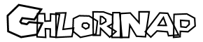 Back in 1998 I created a 26-character font called "Chlorinap" based on the 9 distinct letters on the box of Super Mario 64. I extrapolated what the missing 17 characters should look like to complete the font. Since I had to make up 17 letters, it's possible to tell if a piece of text uses Chlorinap vs. some other Mario-ish typeface. The font was made available for free ("open source fonts") on my homepage*.
On Saturday, I picked up Mario vs. Donkey Kong 2 for my Nintendo DS. It's a pretty sweet game, somewhat of a combination of The Incredible Machine and Lemmings.
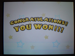 But what was most sweet is that one of the screens in the game uses my Chlorinap font! I verified this by pulling up the 'Congratulations' text in Chlorinap.
 It's been eight years, but it's an awesome payoff. If you're looking for the slow way to break into the video game industry, design a font based on the "Halo" text. In 2014, you'll get to see your handywork in Master Chief vs. Donkey Kong 2!
| Slacker Book Report |
| THE LONG TAIL by Chris Anderson |


2 Comments:
But Jesse Wilson hasn't done anything to update his site since october 4th.
-Regina Rob
"aka undefeated halo champ"
3:15 PM
You have to have something to write...... I have no idea what you are up to ...
10:42 AM
Post a Comment
<< Home